
Brick & Basil
Develop a cohesive brand identity for a modern artisan pizza restaurant that communicates quality, warmth, and authenticity across multiple visual applications. The challenge was to create a versatile system that could adapt to menus, social media, and promotional materials while maintaining brand consistency.
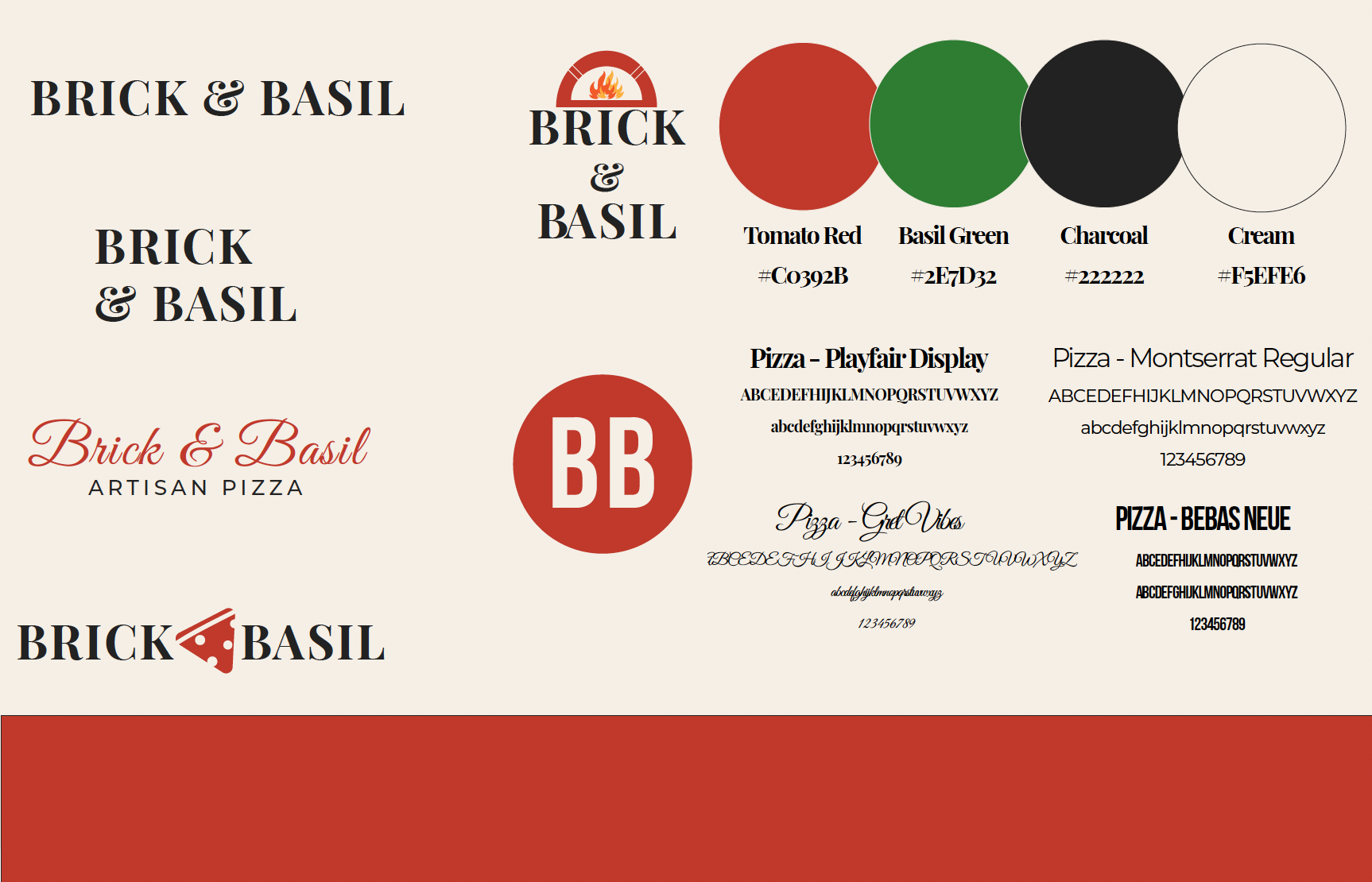
A flexible identity system built around logo variations, a curated four-color palette inspired by natural ingredients — Tomato Red, Basil Green, Charcoal, and Cream — and a four-font type system pairing Playfair Display and Bebas Neue for headlines with Montserrat for body copy. The design balances modern typography with warm color tones to create a recognizable brand presence that holds consistently across print and digital.
Logo Variations, Color Palette & Typography
The visual foundation of Brick & Basil — a four-color palette drawn from natural Italian ingredients, five logo variations, and a four-font type system built to flex across every application. Click to open full size.
 View full size
Promotional Flyers & Ads
A suite of print promotional materials — two ad layouts and a physical flyer mockup — demonstrating the brand system applied to real marketing collateral. Click either image to open it full size.
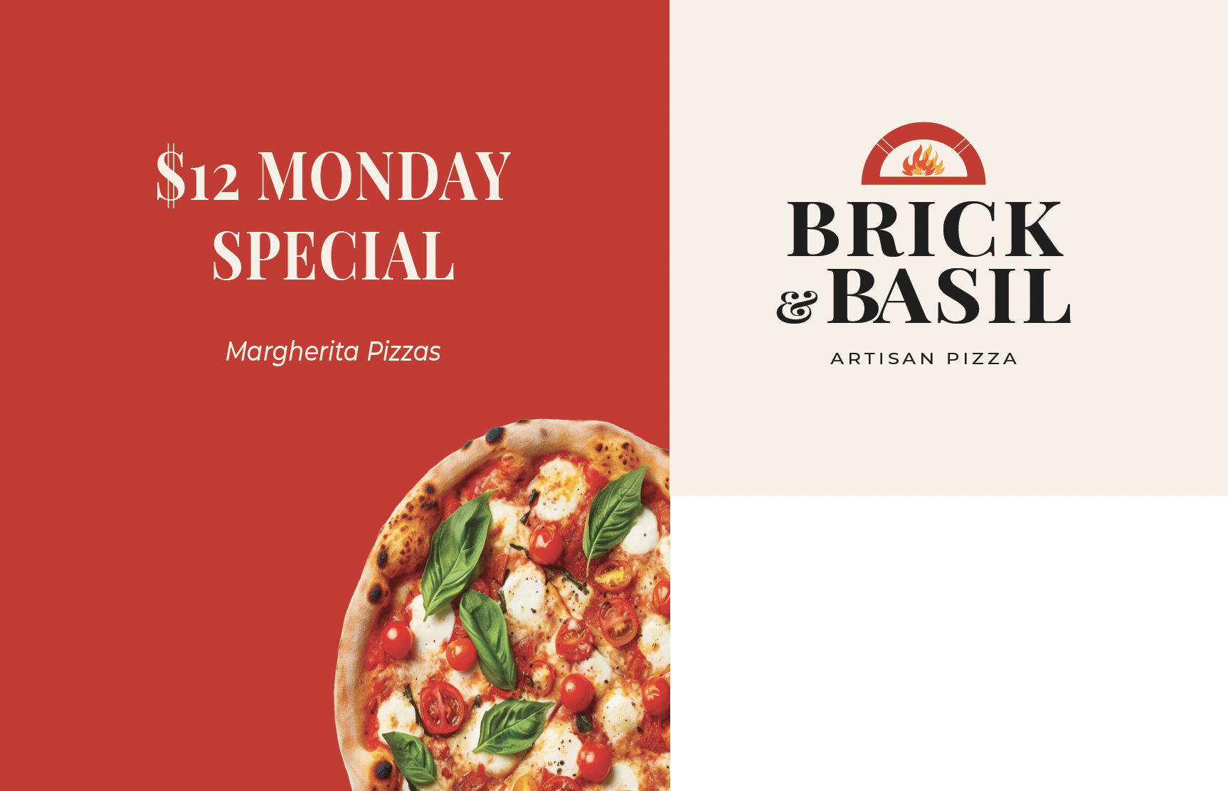
$12 Monday Special & Brand Identity Card
 View full size
A split-panel promotional layout pairing the $12 Monday Special offer with the core brand identity — bold red left panel drives the promotion with a Margherita pizza photo bleeding across the divide, while the cream right panel anchors the brand mark and tagline. Clean and high-contrast, built for both print and digital use.
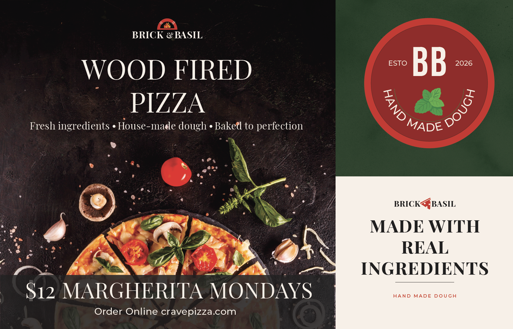
Wood Fired Pizza Ad & Brand Collateral
 View full size
Three collateral pieces on one sheet — a dark-field hero ad (Wood Fired Pizza, Fresh ingredients · House-made dough · Baked to perfection, $12 Margherita Mondays CTA at cravepizza.com), a circular BB badge (Esto 2026 · Hand Made Dough with basil illustration), and a cream ingredient card (Made With Real Ingredients · Hand Made Dough).
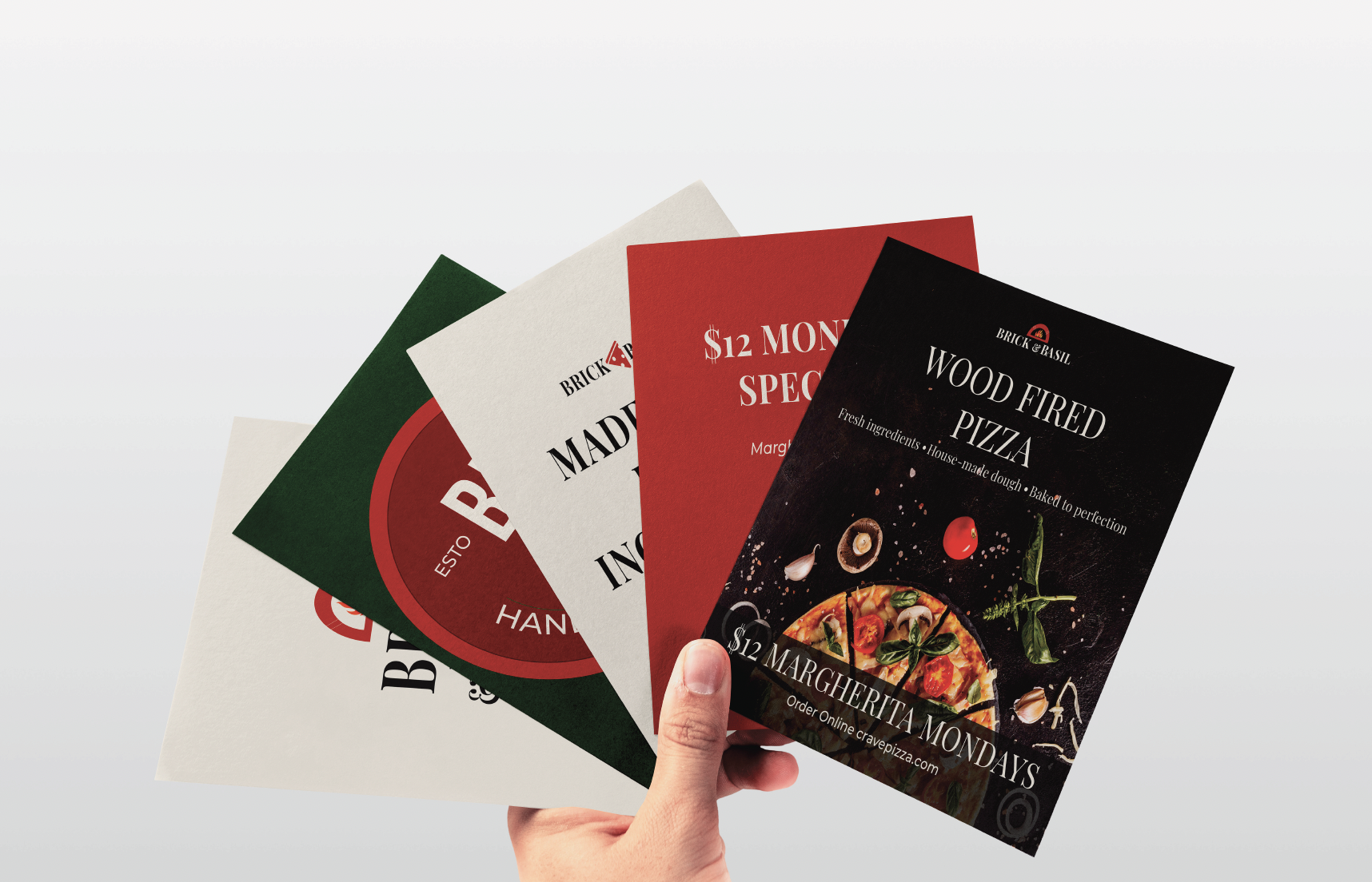
Print Collateral — In Hand
Four branded flyers fanned out in hand — demonstrating the breadth of the print system and how each design reads at physical scale. The green, cream, red, and dark-field variations all maintain brand consistency while serving different promotional functions. Click to open full size.
 View full size
Image Use Notice · Some images used in this project were sourced from publicly available images, including stock photography platforms and Google image search, for educational and portfolio demonstration purposes only. All rights and ownership of original photographs belong to their respective photographers and copyright holders. These designs were created to demonstrate skills in layout, typography, branding, and visual communication and are not intended for commercial use or distribution.